


Brandbook project / [DUC] - Distretto Urbano del commercio
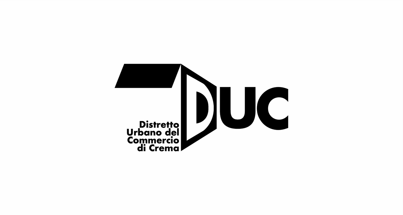
Just two simple geometric shapes are enough to represent a common object in the field of commerce, a box. The level of aesthetic as well as brand quality can be seen in its simplification, where despite few elements being present, the viewer must immediately perceive what it is.
[monogram]
The box is designed to be open not only as a stylistic choice but also in the sense of openness towards the world, in this case, commerce. The perspective signifies that the brand is already looking far ahead, to new horizons; in fact, the front part has not been represented, to prioritize our objectives in the distance, as if we should focus on those.
[palette]
The primary color yellow not only serves to give a sense of energy, positivity, and optimism but also aims to enhance our territory, particularly by taking the color of one of the typical culinary specialties of our region, the "tortelli cremaschi." The combination of black and white, besides giving a sense of elegance in the brand, also serves to evoke balance and harmony.


thank's for the attention
for more information and freelance work please contact me:
follow me on


